By and large, I think schools do a good job of teaching the trade of dental hygiene. But in my experience and informal research, they don’t teach much a lot about putting that education to work (once you are licensed).
Which is both ironic and unfortunate, when you think about it.
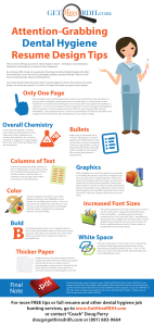
One of the specific things they don’t teach in dental hygiene school is the anatomy of resume design (nor would you expect it). So here’s 10 things that make up a great resume design:
One Page
Most employers don’t read through entire resumes. They would tell you the real value is in meeting with a candidate, hearing what others say about them, or seeing them in action.
Furthermore, everyone knows the length of one’s resume does not equate to the quality of a candidate – not even how long they’ve been a hygienist. I’ve seen two-pagers from hygienists with no experience and one-pagers from those with 30+ years.
Keep it simple and less intimidating – give employers at least a chance to get through it all. There are exceptions, but usually for those that have decades of experience in non-clinical settings.
Overall Chemistry
Create elements (graphics, columns, color, bullets, font treatments, sections, white space) that compliment one another, grab attention, are consistent and allow an employer to easily navigate the resume and find the key things they are searching for.
Bullets
Bullets play an important role in resumes, allowing you to present large blocks of information in short succinct lines. A person can quickly read a line, skip another, or pick up where they left off. Plus, the bullet itself is a graphic of sorts, almost like an arrow that indicates a starting point.
Columns of Text
Instead of creating long single columns of text for bullet points, you can often create a more read-able feel by putting sections of text into columns. I find that this can sometimes save you space and create a more balanced, interesting look.
Graphics
Think of graphics as a visual tour guide to your resume, accentuating key sections and places of emphasis. But also as a way to show creativity and flare, while at the same time drawing in attention. People are attracted to visuals and can absorb them hundreds of times faster than actual text.
I advise my clients to add a professional picture of themselves (sorry, selfies don’t work as well) to help strengthen the visual affect and help create a visual connection with your employer before you even meet them.
Color
Similar to graphics (and often as part of the graphics) add some color highlights to your resume. I’m not talking lots of colors – in fact, no more than one (maybe two). And choose a color that has a look of professionalism and strength, and that maybe compliments your personal brand (ie your personality).
Increased Font Sizes
The most important text on your resume is your name. It needs to stand out in a large and/or bold font that is clear and readable – something strong. How big? I would say in the 24-36 point size range – depending on spacing you have available.
The only other place I would suggest using a larger font is your section headers. For those I would keep them in the 14-18 point range (or roughly half the size of your name).
Bold
Use bold sparingly, but do use it. I typically bold text that is either sub-header in nature or that needs specific emphasis. Often that means bold for the names of the offices you worked for or maybe the schools you graduated from.
White Space
Add some white space to your resume. Don’t settle for the sometimes-stuffy single spacing between lines of text. Open things up where possible to (from 1.15 to 1.5). This gives you a more clean look and feel, that looks sharp and is less intimidating to read.
Thicker Paper
Finally, invest in a nice stock of paper that has a weight somewhere between standard copy paper and card stock. This, too, adds a touch of professionalism conveys an air of strength. Avoid stocks with lots of texture as they tend to no re-produce photos and other graphics very well.
And one final note, never send your resume in Microsoft Word format. Create a PDF file of your resume and send that. The problem with sending a Word document is that it can look all messed up if the receiver doesn’t have the same fonts installed on their computer as you do.
A PDF file, on the other hand, is simply a snap-shot of your resume and fonts don’t matter – what you see is what you get when you create a PDF file.


