“Why am I not getting dental hygienist job interviews?” is the question (mixed with an emotional/frustrated tone) I most frequently get.
While there could be a myriad of reasons, it all boils down to you not doing enough to appear different to employers. We share lots of ways to do this at GetHiredRDH.com.
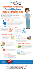
But I am convinced one of the most important and fundamental ways is by creating a more visual resume – one that goes beyond black text on white paper in 12 point Times New Roman font.
Here are four simple tips to make your dental hygienist resume stand out, and thus lead to more interviews.
[Resume Service]

Very few dental hygienist resumes have color on them. I’ve probably looked at nearly a thousand different dental hygienist resumes at this point, and while I have not kept track, I would estimate that only five percent have any color (besides black and white).
Why is that? Probably because it wasn’t too long ago that that was the only option and few people have bothered to change because they think it breaks from tradition.
Is there a rule or etiquette against it for resumes? Definitely not! So do it, just don’t over-do it. Use color to accentuate, not dominate your resume. This will add a quiet, yet significant confident professionalism to your resume.
I recommend using color in the following elements:
- Picture of you
- Lines, boxes and other “graphics”
- Headlines (your name)
Avoid color in the main body of text – bullets (the actual element) is optional. I also recommend not using more than one color.
Picture of You
Everyone has an opinion on adding a picture of themselves to their resume. My advice is simple – if you don’t feel comfortable with it for any reason then don’t do it. However, it factually does make your resume stand out and get noticed.
Your picture is like your own personal logo. It’s a valuable part of marketing you because it helps identify your brand similar to how the swoosh helps to identify Nike. Your “logo” coupled with your personal brand statement or promise is a powerful tool in helping employers connect with you which ultimately leads to them building a relationship of trust with you.
Still not convinced?
Consider this, 94% of employers admit they Google the names of job applicants they are interested in hiring. Why? Because they want to know more about you than what your resume has, including what you look like.
Wouldn’t it be better to display a professional head shot on your resume – a picture that you approve of and feel represents you well? The Internet may serve up something less flattering of you from your past (Google your name and see for yourself). Or, even worse, it could show a picture of someone else that an employer may assume is you.
Again, it’s a personal decision that everyone has to make for their own unique situation, but if you are on the fence, hopefully I have helped you jump to one side or the other.
A final word on this – sign up for a LinkedIn.com account. When people do Google names, often what will come up at the top of the results is your LinkedIn profile. You can also post your professional picture and resume information there for people to see.
And LinkedIn is a great networking tool. We co-manage a LinkedIn user group called Dental Hygienists that I encourage you to join – this will link you to thousands of other professional hygienists across the world, where you can share ideas, ask questions and discuss issues.
Other Graphics
Lines, boxes, interesting icons, and even bullets are considered accents to your resume and they aren’t pointless window dressing – they give your eyes a rest. Reading is work. It requires intense levels of concentration and thinking so a reader can understand what’s being communicated.
Graphics are like seeing a bench after hiking through a mall all day. When placed strategically, they give your reader’s eyes a quick break to rejuvenate. And after reading 40-50 resumes, an employer’s eyes not only enjoy seeing these little benches, they long for them.
What this all means, of course, is the more visually-pleasing breaks you can offer, the more time they will spend with your resume and more favorable they will be toward it. It’s that simple.
White Space
The absence of graphics and text is really just an extension of what we were talking about with other graphics. It’s a break for the eyes and in general gives you a more organized-, professional-, clean-feel. Try it out – take a page of single-spaced text and compare it to a page of 1.5 or double-spaced text and see which you think looks easier/faster to navigate and read.
I think it’s also nice for the person screening you, to give them room to make notes right on your page.


